各国の年収比較
23, 2021
·
3 分で読める
OECDのサイトに各国の平均年収のデータがあったのでPythonでグラフにしてみた。
ライブラリとデータの読み込み
import pandas as pd
import matplotlib.pyplot as plt
import matplotlib.ticker as ticker
import seaborn as sns
import plotly.express as px

file = "AV_AN_WAGE_22072021122640139.csv"  # ダウンロードしたデータ
df = pd.read_csv(file)
データの中身はこんなかんじ
display(df.head(3))
| COUNTRY | Country | SERIES | Series | TIME | Time | Unit Code | Unit | PowerCode Code | PowerCode | Reference Period Code | Reference Period | Value | Flag Codes | Flags | |
|---|---|---|---|---|---|---|---|---|---|---|---|---|---|---|---|
| 0 | AUS | Australia | CPNCU | Current prices in NCU | 2000 | 2000 | AUD | Australian Dollar | 0 | Units | NaN | NaN | 46286.111081 | NaN | NaN |
| 1 | AUS | Australia | CPNCU | Current prices in NCU | 2001 | 2001 | AUD | Australian Dollar | 0 | Units | NaN | NaN | 48366.628479 | NaN | NaN |
| 2 | AUS | Australia | CPNCU | Current prices in NCU | 2002 | 2002 | AUD | Australian Dollar | 0 | Units | NaN | NaN | 50109.137562 | NaN | NaN |
SERIES列にはCPNCU, CNPNCU, USDPPPが出てきて,Series列の省略形になっている。
CPNCUはCurrent prices in NCUCNPNCUは2020 constant prices and NCUUSDPPPはIn 2020 constant prices at 2020 USD PPPs
経済には疎くて用語がわからないのでGoogleで調べてみた
- current prices : 名目賃金(額面金額)
- constant prices : 実質賃金(インフレによる通貨価値の減少を考慮した金額)
- USD PPPs: 各国の購入力を考慮したUSDへの換算レート(Purchasing Power Parity)
上記のCPNCUとCNPNCUは自国通貨でのcurrent pricesとconstant prices。USDPPPはインフレ率を勘案したUSDへの換算額(2020年度)ということらしい。
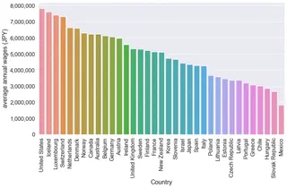
最新データ(2020年)による年収ランキング
- インフレ率分割り引いた年収ランキング(USDPPP)
- 1ドル112.58円(上記データで2020年度データに使われている換算レート)で換算す
# reshape data
usdjpy = 112.58

# ranking data
ranking = df[(df["Time"] == df["Time"].max()) & (df["SERIES"] == "USDPPP")].sort_values(
    by="Value", ascending=False
)
ranking["Value"] = ranking["Value"] * usdjpy


# plot data

sns.set_theme(
    rc={"figure.figsize": (12, 8),}, style="darkgrid",
)
sns.set_context("notebook", font_scale=1.5)

ax = sns.barplot(x="Country", y="Value", data=ranking)
ax.set(ylabel="average annual wages (JPY)")
plt.xticks(rotation=90)
plt.gca().yaxis.set_major_formatter(
    plt.matplotlib.ticker.StrMethodFormatter("{x:,.0f}")
)

plt.tight_layout()

日本はどこか探してみてください。
賃金の年次変化(matplotlib版)
実質賃金の推移
まずはUSDPPP(インフレ率分割り引いた実質賃金)のデータ表示。各国の2000年の賃金を1とする。
dot_usdppp = df[df["SERIES"] == "USDPPP"][["Country", "Value", "TIME"]].pivot(
    index="TIME", columns="Country", values="Value"
)
dot_usdppp = dot_usdppp.div(dot_usdppp.iloc[0])
dot_usdppp.head(3)
| Country | Australia | Austria | Belgium | Canada | Chile | Czech Republic | Denmark | Estonia | Finland | France | ... | Norway | Poland | Portugal | Slovak Republic | Slovenia | Spain | Sweden | Switzerland | United Kingdom | United States |
|---|---|---|---|---|---|---|---|---|---|---|---|---|---|---|---|---|---|---|---|---|---|
| TIME | |||||||||||||||||||||
| 2000 | 1.000000 | 1.000000 | 1.000000 | 1.000000 | 1.00000 | 1.000000 | 1.000000 | 1.000000 | 1.000000 | 1.000000 | ... | 1.000000 | 1.000000 | 1.000000 | 1.000000 | 1.000000 | 1.000000 | 1.000000 | 1.000000 | 1.000000 | 1.000000 |
| 2001 | 1.010883 | 0.996962 | 1.003084 | 0.995891 | 1.02740 | 1.051571 | 1.006660 | 1.034993 | 1.005260 | 1.006325 | ... | 1.024379 | 1.057132 | 1.004056 | 1.000000 | 1.040772 | 0.994779 | 1.011863 | 1.057034 | 1.042075 | 1.008469 |
| 2002 | 1.017842 | 1.012392 | 1.028910 | 0.987594 | 1.03634 | 1.115248 | 1.029816 | 1.096847 | 1.010661 | 1.033491 | ... | 1.066971 | 1.054004 | 1.003560 | 1.051607 | 1.043738 | 0.999752 | 1.025093 | 1.077983 | 1.058818 | 1.016417 |
3 rows × 35 columns
グラフ表示は関数にしておく。
def plot_change(df, ylabel="wage increase"):
    sns.set_context("notebook", font_scale=1.5)
    ax=sns.lineplot(data=df, dashes=False)
    sns.lineplot(data=df["Japan"], palette="Red",linewidth=5, dashes=False)

    plt.legend(bbox_to_anchor=(1.01, 1), borderaxespad=0)
    ax.set(xlabel="year", ylabel=ylabel)
    ax.xaxis.set_major_locator(ticker.MultipleLocator(5))
    plt.setp(ax.get_legend().get_texts(), fontsize="12") # for legend text
    plt.show()

plot_change(dot_usdppp, ylabel="constant wage increase")
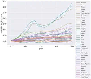
日本はオレンジの太線で上書きしている。安定性抜群なことがわかる。
名目賃金のグラフも作ってみる。
dot_cpncu = df[df["SERIES"] == "CPNCU"][["Country", "Value", "TIME"]].pivot(
    index="TIME", columns="Country", values="Value"
)
dot_cpncu = dot_cpncu.div(dot_cpncu.iloc[0])
plot_change(dot_cpncu,ylabel="current wage increase")
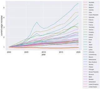
日本は座標軸のように横に伸びている。 外資系の企業から給料をもらって,日本で暮らすというのがお得かもしれない。 IT系だったらリモーワーク可のところも増えているみたいだしね。